Commerce

CONTEXT
• Tile had been relying on DTC revenue from our website and had no opportunities to purchase hardware pieces on the Tile mobile app. A huge missed opportunity.
• At the same time, we began the process of re-platforming our website and had the opportunity to redesign our e-commerce experience. This was a massive coordinated effort cross-functionally across platforms and channels to drive DTC revenue and update functionality and design that took several quarters to complete.
CHALLENGES
How about all of them?! Time, tech, resources, collaboration, ADA compliance…you name it, we had to overcome it.
MY ROLE
Cross-functional collaboration. Stakeholder alignment and negotiation. Guided design vision, strategy, UX/UI, prototyping, A/B testing, validation, and implementation.
THE TEAM - App
Design Lead, Yingri Guan
Design Lead, Cihang Yang
Senior Director of Mobile Engineering, Mike Chrabaszcz
VP of Product and Design, Winnie Wong
Chief Product Officer, James Selby
THE TEAM - Web
Design Lead, Ashley Molina
Design Lead, Yingri Guan
VP of Engineering, Jossie Haines
Director of Product Management, E-commerce, Eumir Nicasio
Head of DTC, Karaline Goldmark
Vice President of DTC & Marketing, Kathy Ando
Principal Technical Program Manager, eCommerce, Ed Buturla
RESULTS
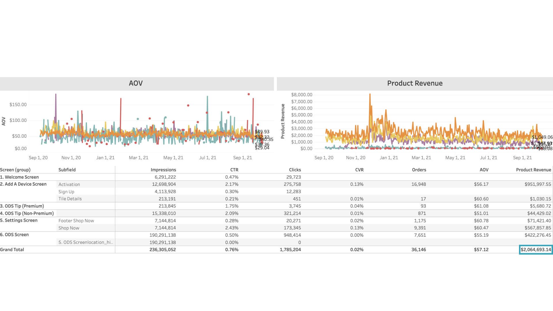
• Grew In-App DTC revenue by $5M in the first quarter of the release.
• Helped grow DTC revenue to $100M (+11% YOY)
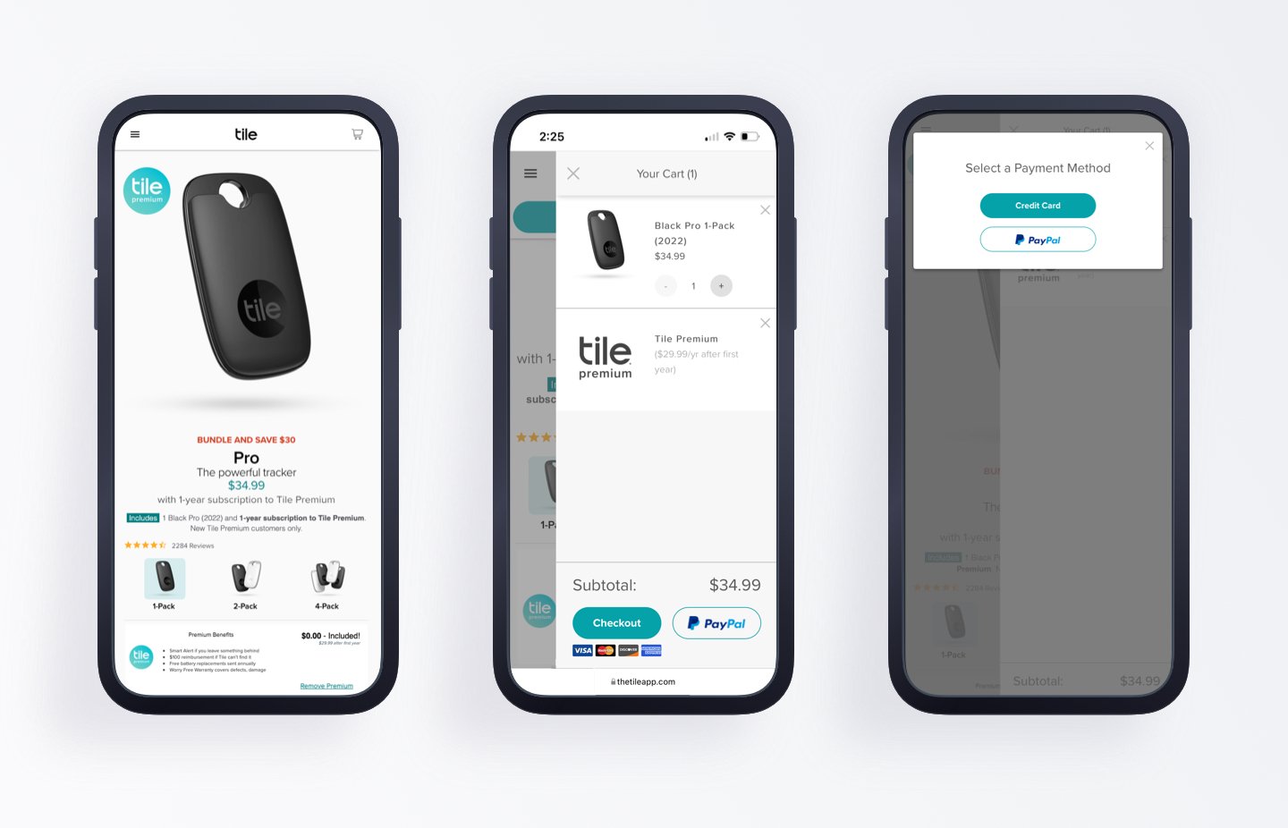
BEFORE: Checkout flow, e-commerce
Full of Friction
1. The original product detail page only shows one product at a time. And with increasing SKUs, customers were finding it tedious to shop.
2. The original checkout experience is also full of friction. There is a cart with multiple payment options at the bottom. After clicking checkout, customers are prompted again to pick a payment method. The following steps also include friction points, such as long forms for filling addresses.
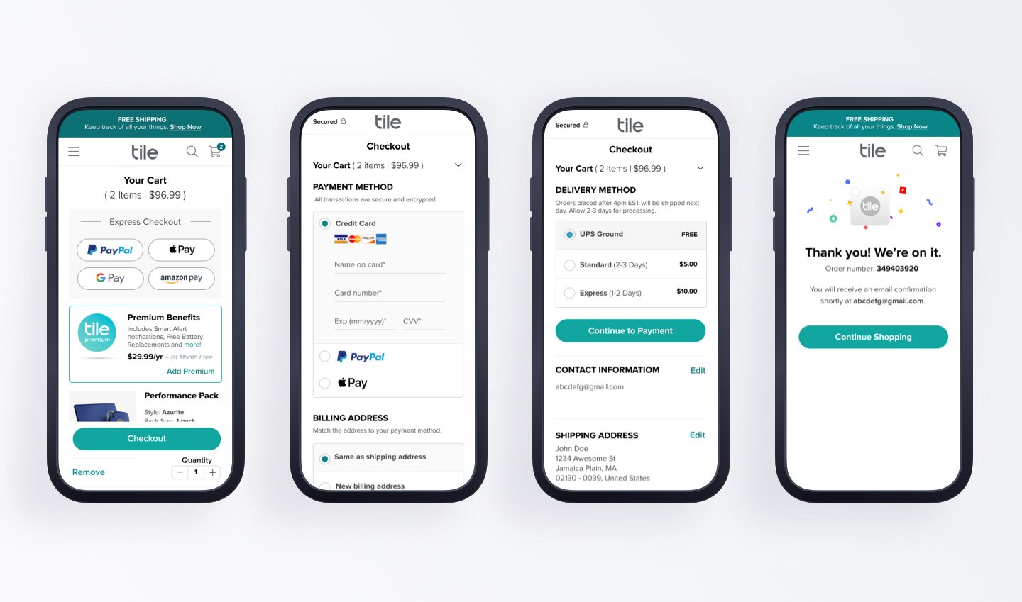
AFTER: Checkout flow, e-commerce
Optimized
• We combined best checkout flow practices with iterative testing.
• An express option and accordion-style checkout information forms are used to keep the process confined to one page.
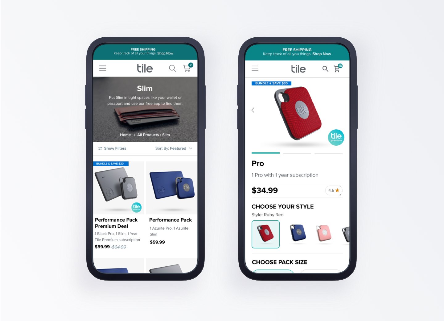
AFTER: Home page and product detail page, e-commerce
Optimized
• The previous design focused mainly on showcasing individual Tile products rather than optimizing for shopping.
• The improved shopping flow now displays more products on the screen, making it easier for customers to browse through all available items.
• The product detail page has been enhanced to assist customers in making informed decisions about their Tile purchases.

In-App
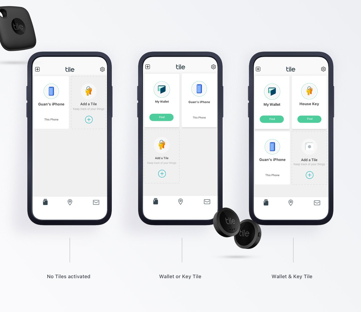
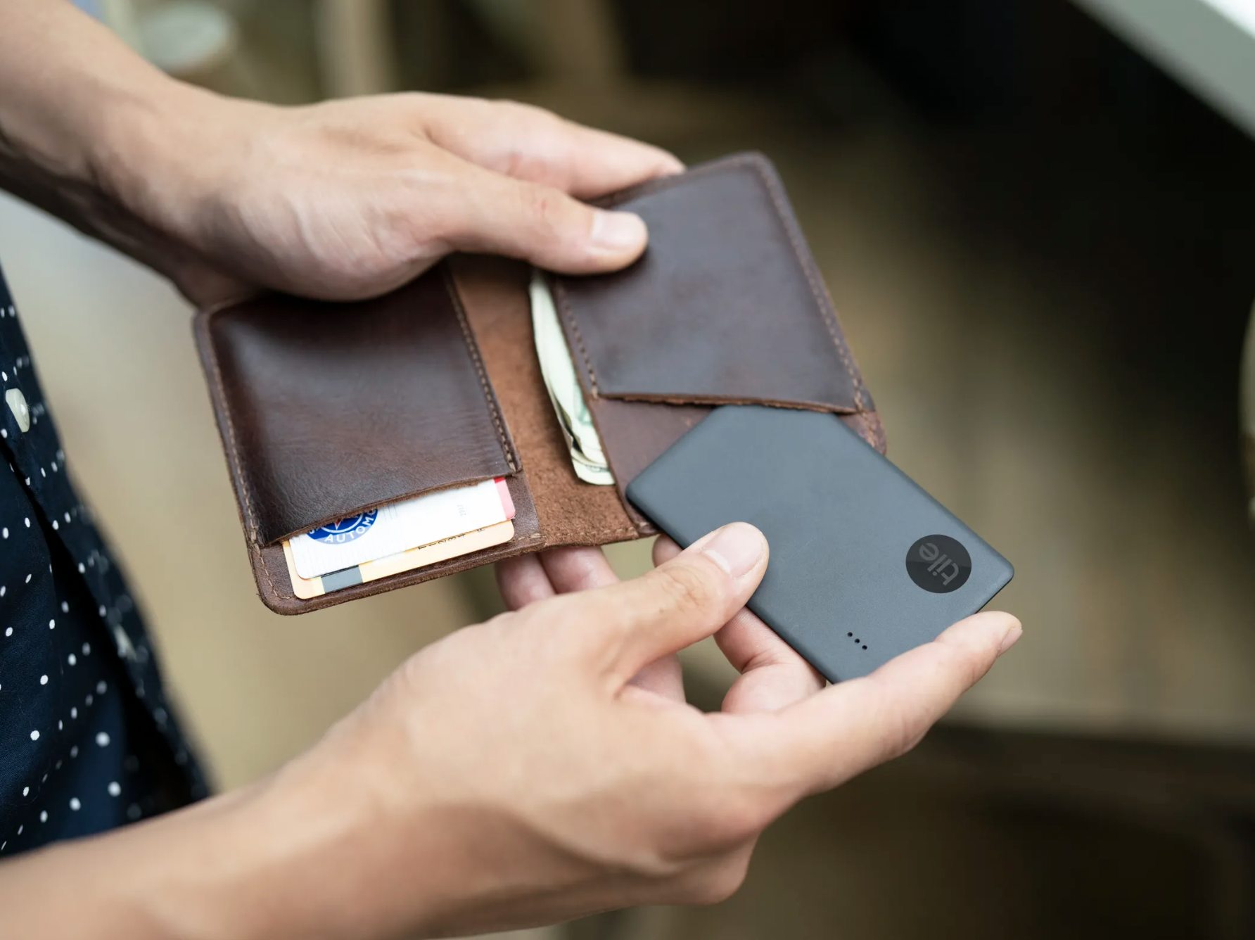
• Data shows over 95% of customers have 0 - 2 Tiles. And the top categories for Tiled items are keys and wallets.
• To drive more Tile activations on the app and boost engagement, we introduced a personalized card featuring a Tile use case to inspire customers to purchase and provide a shopping opportunity.
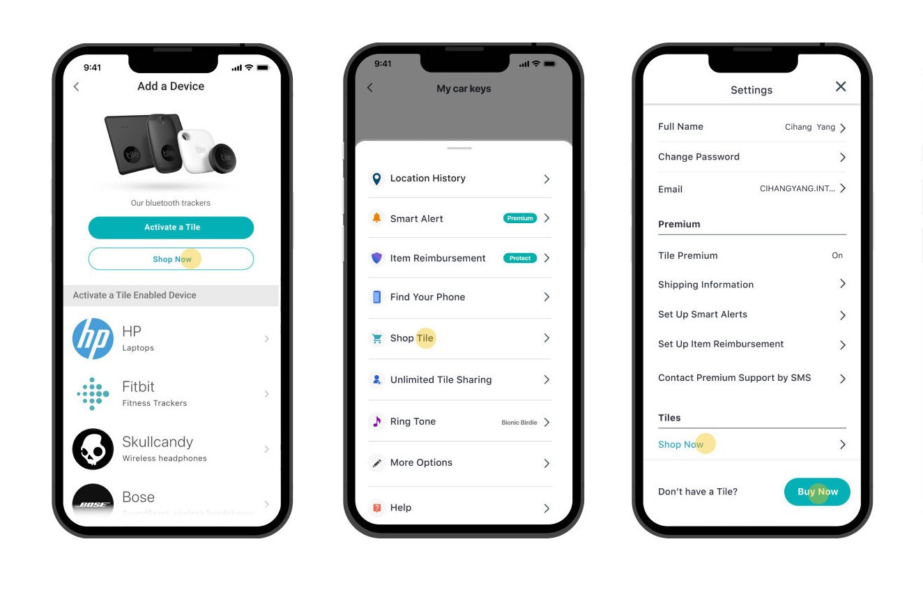
Multiple shopping discovery points, m-commerce
The main improvement added a prominent “Shop Now” button when choosing a product to activate. This solution alone brought in $5M of hardware revenue in the first quarter of launch! Additional entry points are added to the app where appropriate.

In-App, m-commerce
• When a Tile “died”, it had to be replaced with a new Tile or the customer had to replace the coin-cell battery.
• Previously, when a Tile is running low on power, the prompt to replace it has a red warning banner that was unnecessarily alarming.
• The new designs had a more pleasant replacement prompt with a guided approach and intuitive shopping experience.
